Visualizations and dashboards
You would typically get a dashboard on any enterprise grade monitoring solution however a simple dashboard usually does not tell the whole story. Even more it can get frustrated if you need to write a complex query to get the data out. This is not the case with Opvizor.
Opvizor ships intuitive dashboards grouped in logical areas like starters, performance, capacity and planning. With a set of curated dashboards per each section we ship a large collection of visualizations at all layers. In total 50+ dashboards are available where each one of them contains more than 10 panels.
See how Opvizor compares to other products on specific areas
| Opvizor | Dynatrace | Datadog | Instana | Netdata | |
|---|---|---|---|---|---|
| Provisioned dashboards for all metrics | yes | - | - | - | yes |
| Provisioned dashboards for a single host | yes | partly | partly | partly | yes |
| Provisioned dashboards for a flee of hosts | yes | - | partly | - | yes |
| Provisioned dashboards for distributed systems | yes | - | partly | - | yes |
| Metrics explorer | yes | yes | yes | - | yes |
| Customizable dashboards | yes | yes | yes | - | yes |
| Live always up to date dashboards | yes | - | - | yes | yes |
| Context aware AI assistant per metrc | yes | - | - | - | - |
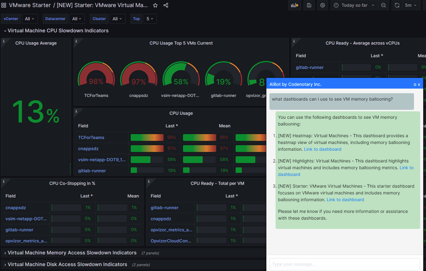
Here is one of our dashboards where AI assistant helps to navigate through Opvizor dashboaards linking specific drill-down dashboards where you can jump right away.
Useful links